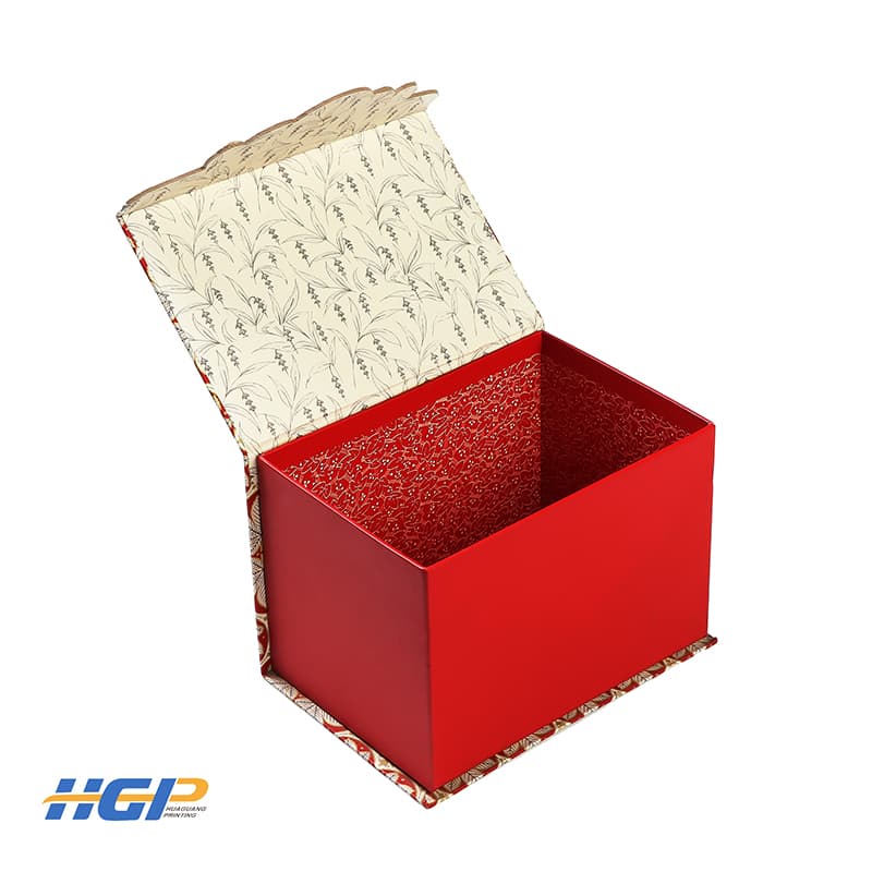
This gift box is mostly red, which is warm. Color language is an important part of design. Color is our first impression of things. When people are watching, they have a deeper impression of color than other visual elements. Reasonable color, can better display the design content and is conducive to information transmission, can more effectively attract the audience, can more accurately with the audience's psychological echo, can add more charm for the design.

The purpose of the design is to enhance the power of information transmission by improving the quality of information transmission. As an important element in the process of information transmission, color can endow information with rich aesthetic feeling and effectively improve the quality of information transmission. The reasonable use of color is very important for the gift box. Reasonable use of color language in the design can better guide the audience to complete the process of information acquisition, so that the design has a stronger visual cognition and artistic appeal, to obtain a wider space for communication.

Excellent design has good color inevitably, also can make a person inevitably photographic never forget. In colorific language expression, use colorific characteristic, hold colorific contrast and harmonious relation is particularly important.

There is such a principle: color identification
The recognition of color should first consider the degree of recognition. It should be legible. Different groups have different backgrounds and therefore have different ability to discern colors. When designing, avoid choosing the color that is low in audience recognition, or is not easy to distinguish; To choose the target group easy to identify the color as far as possible, so that the most effective use of mass communication groups to achieve the purpose of propaganda. Bright red, obviously it's very recognisable and visually striking. This gift box is chosen in a large area of red, no one can escape the attraction of it.